
Storefront Window Graphics Printing That Gets Seen
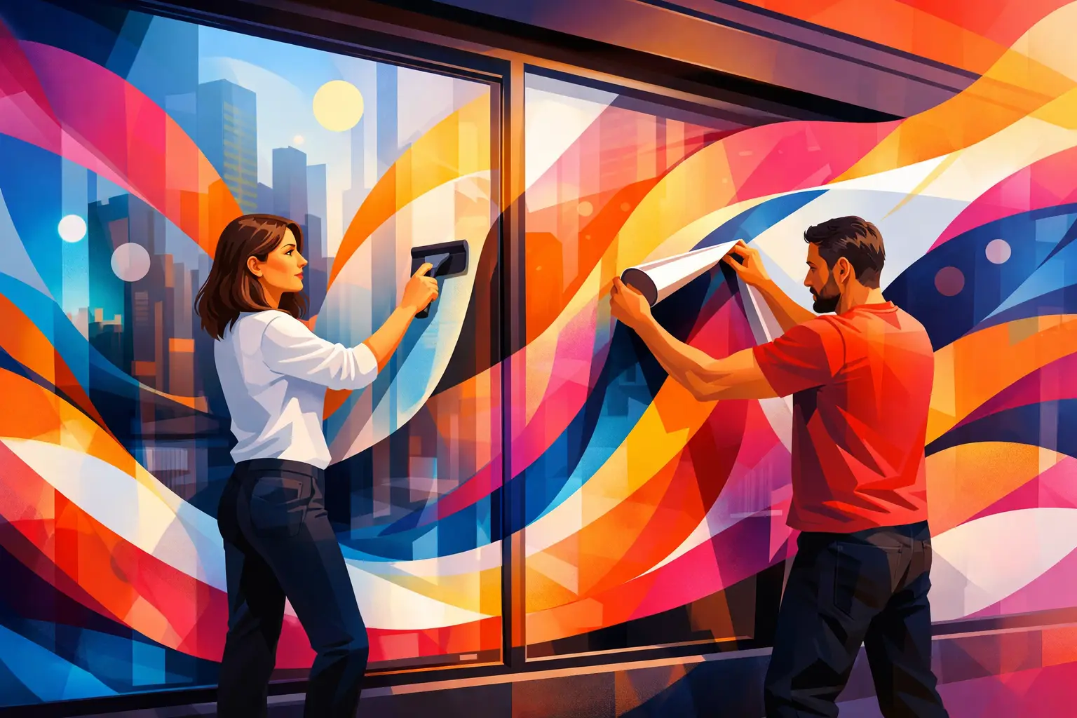
A storefront has only a few seconds to make its case. Before a customer reads a menu, walks an aisle, or speaks with your team, they notice the glass. Storefront window graphics printing gives that high-visibility space a job: announce who you are, direct foot traffic, promote an offer, or build a stronger visual presence from the sidewalk.
For retailers, restaurants, salons, offices, fitness studios, and service businesses, window graphics can do more than decorate an entry. The right design can make an unfamiliar business feel established, make a seasonal campaign impossible to miss, and turn empty windows into useful marketing real estate. The strongest results come from planning the message, material, and placement together rather than treating the window as an oversized poster.
Start With the Customer View, Not the Artwork
The best window graphic begins outside the building. Stand where a passerby, driver, or first-time visitor will see your storefront. What can they realistically read? What part of the window is blocked by reflections, shelving, displays, or door hardware? Does the business need to be recognized from across the street, or does it need to explain an offer to someone already at the entrance?
This perspective helps determine what belongs on the glass. A business name, logo, short category statement, and hours often work well near an entrance. Larger panes facing traffic may be better suited to a bold sale message, a hero image, or one simple value proposition. Trying to put every service, promotion, phone number, and social handle on one window usually weakens the result. Glass is visible space, but it is not unlimited attention.
Think about the next action, too. A window graphic may need to guide visitors to a door, notify them of a new location, reinforce a product launch, or create privacy in an active workspace. Once that purpose is clear, the design becomes easier to prioritize.
Choose the Right Storefront Window Graphics Printing Material
Material affects appearance, durability, installation, and how much natural light remains inside. A polished print job should fit the practical demands of the location, not just look good in a digital mockup.
Clear window film is a smart choice when the design needs to appear directly on the glass while preserving an open, airy view. It works well for logos, hours, minimal illustrations, and designs with intentional clear areas. Because transparency changes how colors appear against the street and interior background, artwork may need a white ink layer or adjusted color treatment to maintain contrast.
Opaque vinyl provides stronger color and full visual coverage. It is often the better option for large promotions, bold branded panels, or storefronts where the message needs to stay readable despite busy interiors and changing light. It can also conceal a less-than-perfect view into the space, though covering too much glass can make a storefront feel closed off.
Perforated window film offers a useful middle ground. From the outside, it can display full-color graphics; from the inside, it allows a degree of outward visibility. This makes it popular for street-facing windows where branding and light matter equally. Results depend on lighting conditions, the size of the perforations, and the amount of ink coverage, so it is worth discussing the specific setting before production.
Frosted or etched-look film is ideal for privacy with a refined finish. Medical offices, salons, conference rooms, and professional services often use it on doors, sidelights, or lower window sections. It can carry a logo or pattern while softening direct sightlines without making the room feel dark.
For short-term promotions, removable graphics can keep campaigns current without committing the window to a permanent treatment. For long-term branding, a more durable film and professionally considered installation plan may offer better value. The right choice depends on how often the message changes, how much sun the window receives, and whether the surface will be cleaned frequently.
Design for Distance, Daylight, and Movement
Storefront design lives in a far less controlled environment than a brochure or business card. People see it while walking, driving, waiting at a light, or passing through a crowded sidewalk. Sun glare shifts. Interior lights come on. Nearby signs compete for attention. That is why clarity should lead every design decision.
Use large type for the primary message and give it enough contrast against the background. A logo may be familiar to existing customers, but a short line such as “Fresh Coffee Daily,” “Now Leasing,” or “Walk-Ins Welcome” helps new customers understand the business immediately. If the message cannot be understood in a quick glance, reduce it.
High-resolution images are equally important. Small online images may look acceptable on a screen but appear soft or pixelated when enlarged for a window. Brand colors should be reviewed with the final material in mind, especially on clear, perforated, or frosted films where the glass and ambient light influence the finished look.
Leave breathing room around essential information. A clean composition with one obvious focal point tends to look more premium and performs better from a distance than a crowded layout. That does not mean every window needs a minimal look. A beauty brand, toy store, or fashion retailer may benefit from expressive color and pattern. The point is to give the eye a clear path through the design.
Use the Window Layout Strategically
Not every part of the window is equally valuable. Place core identity and conversion-focused information where it will not be obscured by displays, parked vehicles, or door handles. Lower sections are useful for privacy, decorative borders, or secondary messaging. Upper sections can be highly visible from farther away, especially when the interior is busy.
For door graphics, keep safety and usability in mind. Customers need to see handles, entry points, and any required notices. On multi-window storefronts, treat each pane as part of one coordinated composition. Repeating the same graphic on every panel can feel flat, while a visual sequence can lead customers naturally toward the entrance.
Prepare Artwork Before It Reaches Production
Accurate measurement is where a great concept becomes a graphic that fits. Measure the visible glass area, then identify mullions, frames, handles, locks, decals, and any obstructions. Confirm whether the graphic will be installed inside or outside the glass. This decision changes the file setup, especially when artwork needs to be reverse printed for interior application.
Build files at the correct scale with adequate resolution, and extend backgrounds beyond the intended trim area to allow for clean finishing. Keep essential text and logos away from edges, since slight variations in placement are more noticeable when a design is pressed against a frame.
If the window is part of a regulated business environment, verify local requirements for accessibility notices, hours, permits, or visibility before finalizing the design. A print partner can help flag production considerations, but the business should confirm requirements specific to its location.
The production proof is an important checkpoint. Review spelling, phone numbers, dates, offer details, brand colors, and placement notes carefully. A window graphic is highly public, so even a small error can be expensive in lost credibility and reprinting time.
Plan Installation for a Premium Finish
A beautiful graphic can look disappointing if it is installed over dusty glass, misaligned, or trapped with bubbles and wrinkles. Clean, dry glass is essential. Installation conditions matter as well: extreme heat, cold, wind, and high humidity can affect handling and adhesion.
Simple decals may be manageable for a confident in-house team, especially at small sizes. Large panels, perforated films, multi-pane layouts, and precision-cut designs deserve experienced installation. The cost of professional application is often modest compared with the impact of a straight, smooth, long-lasting finish.
Plan maintenance from the beginning. Use gentle cleaning methods that will not lift edges or scratch the print, and replace graphics when promotions end or the surface begins to show wear. Faded graphics and outdated offers tell customers that details are not being managed. Fresh, well-maintained windows communicate the opposite.
Make Your Windows Part of the Campaign
The most effective graphics do not operate alone. Match the storefront message to the campaign customers see on postcards, banners, counter cards, event displays, and social content. A consistent visual system helps people recognize the business at each touchpoint and makes a limited-time offer feel more credible.
Seasonal changes are especially valuable for businesses with repeat foot traffic. A restaurant can promote catering before the holidays, a retailer can refresh windows for a product launch, and a service business can highlight a timely offer without changing permanent signage. The key is to retain recognizable brand elements so frequent customers still know they are in the right place.
When you are ready to turn a blank pane into a business asset, bring the goal, measurements, and a few visual references to the conversation. Platinum Print can help shape those details into a finished window graphic that looks considered from the curb and stays true to the quality behind your brand.