
Retractable Banners for Trade Shows That Get Seen
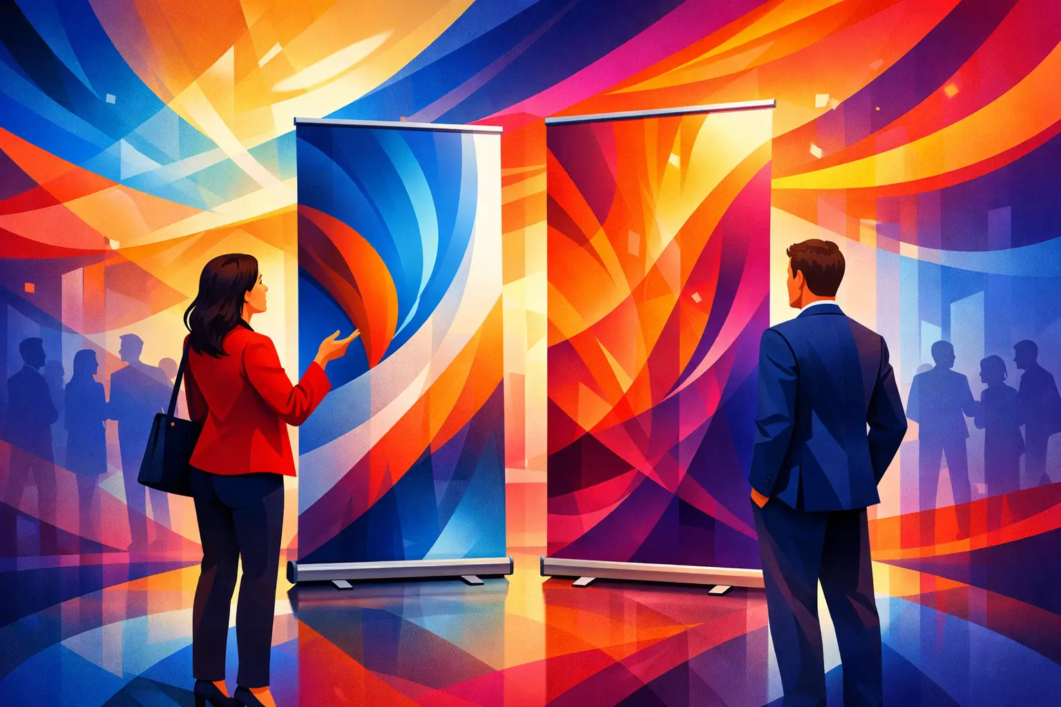
A trade show floor gives every exhibitor the same basic challenge: earn a second look before an attendee walks past. Retractable banners for trade shows give your booth a fast, polished way to communicate who you are, what you offer, and why visitors should stop. They are compact enough for busy event logistics, yet large enough to make your branding visible above the visual noise.
The best banner is not simply the one with the brightest color or biggest logo. It is the one that delivers one clear message at a glance, supports the rest of your display, and arrives looking as professional as the business it represents.
Why Retractable Banners Work at Trade Shows
Trade show marketing has to work quickly. Attendees are scanning aisles, comparing vendors, meeting colleagues, and moving toward scheduled appointments. A retractable banner creates a vertical focal point that can be read from several feet away, even when tables, product samples, and people fill the booth.
Its practical advantage is just as valuable. The printed graphic rolls into a protective base, making the banner easier to carry, store, and transport than rigid signage. Setup typically takes moments: place the base, extend the banner, and secure the support pole. For teams managing a tight load-in window or traveling between events, that simplicity matters.
A banner stand is also a flexible investment. Use it behind a registration table, beside a product display, near a presentation area, or at an off-site meeting. When the graphic is designed with a longer campaign in mind, it can keep working after the show ends.
Start With the Job Your Banner Needs to Do
Before choosing a size, finish, or design direction, decide what the banner must accomplish. A banner at the front edge of a booth has a different purpose than one positioned behind a sales team. The first needs to attract attention from the aisle. The second can reinforce credibility and provide detail while a conversation is already underway.
For most businesses, one of three jobs should lead the design: introduce the brand, promote a specific offer, or explain a focused solution. Trying to do all three at once often produces a crowded layout that is difficult to understand from a distance.
A brand-introduction banner should prioritize a recognizable logo, a concise value statement, and a visual that reflects your category. A promotional banner can highlight a new service, limited event offer, or product launch. A solution-focused banner works well for B2B teams that need to state the customer problem they solve and the outcome they deliver.
The strongest message is usually specific. “Custom packaging for growing retailers” tells a visitor more than “Quality solutions.” “Book a complimentary design consultation” creates a clearer next step than “Contact us.” Your booth staff can handle nuance. Your banner should create the opening.
One Banner or a Coordinated Set?
A single retractable banner is an excellent choice for small booths, tabletop exhibits, pop-up events, and teams that need a portable branded backdrop. It can also be the right answer when the goal is simple awareness rather than a full product presentation.
Two or three coordinated banners can make more sense for a larger footprint. One can carry the main brand message while the others feature services, product categories, client benefits, or a campaign visual. The key is coordination, not repetition. Three banners that each repeat the same logo and paragraph waste valuable space.
Think of the set as a visual conversation. From the aisle, the visitor sees the brand and central promise. At the booth, they see supporting proof and relevant details. This layered approach helps your space feel intentional without turning every surface into an advertisement.
Design Retractable Banners for Distance First
Trade show banner design is not brochure design. Fine print, long web addresses, dense service lists, and small images may look acceptable on a computer screen but disappear on the event floor. Build the layout around the distance at which people need to read it.
Keep the headline short and large. Use high-contrast colors between text and background, especially if the venue lighting may be uneven. Choose one primary image or graphic direction rather than several competing visuals. A strong product photograph, a confident team image, an architectural detail, or an original branded illustration can create more impact than a collage.
Your logo should be visible, but it does not need to dominate every inch of the banner. Attendees need a reason to care before they need to memorize your company name. Place the logo where it is easy to find, then allow the headline and image to do their jobs.
A practical layout often follows a natural reading path: logo at the top, a bold statement through the main viewing area, and a concise call to action near the lower portion. However, placement depends on the booth and banner size. If a table or display blocks the lower third, do not put essential information there.
Use a Call to Action That Fits the Event
Trade shows are built for interaction, so your call to action should invite one. Depending on your goals, that might be “See the collection,” “Ask for a sample,” “Schedule a demo,” or “Scan for show pricing.”
A QR code can be useful when it leads to a focused landing page, appointment form, digital catalog, or event offer. It should be large enough to scan reliably and supported by a short instruction. Do not make the QR code the entire strategy. A visitor should still understand what you offer without pulling out a phone.
Choose Quality That Holds Up Under Real Event Conditions
A retractable banner is a working display piece. It gets packed, unpacked, carried through convention centers, and used under bright lights. Print quality and hardware quality both affect how your brand is perceived.
Look for crisp graphics, accurate color reproduction, and material that lies flat when extended. A banner that curls, looks washed out, or shows visible banding can undermine an otherwise well-designed booth. The base should feel stable, and the support system should be easy for your team to use without guesswork.
There is a trade-off between the lowest upfront price and long-term value. If you need a banner for one local event, a basic option may be appropriate. If you exhibit regularly, present to clients, or rely on the banner as a core part of your display, investing in dependable hardware and professional production can reduce replacement costs and last-minute stress.
For premium brands, the finish should align with the rest of the experience. If your business hands out luxe business cards, carefully packaged samples, or high-end product materials, a thin, poorly printed banner creates an avoidable disconnect. Consistency is part of visual credibility.
Plan for the Booth, Not Just the Banner
A beautiful banner can still underperform if it is placed poorly. Before the event, review the booth dimensions, neighboring exhibitors, table placement, electrical access, and traffic flow. Stand at the imagined aisle edge and consider what a visitor will see first.
Place retractable banners where they frame the booth rather than create obstacles. Avoid blocking entrances, hiding product displays, or forcing staff to stand in front of the main message. If your booth has a corner position, a banner angled toward approaching traffic can help attract attention from both directions.
Bring the banner into the larger brand system. Match its typography, colors, imagery, and tone to your handouts, table cover, presentation screen, name badges, and product packaging. When every piece feels connected, your company looks established and prepared, even in a modest booth space.
Build in Time for Review and Production
Trade show deadlines have a way of becoming urgent. Venue shipping dates, booth contractor schedules, and internal approvals can all compress the timeline. Start the banner process early enough to review the design at full scale, confirm event requirements, and allow time for production and delivery.
A professional review is especially useful when your team is adapting existing marketing materials for a large-format display. What works in an email campaign or social graphic may need a cleaner hierarchy, bolder typography, or different image crop on a banner. Personalized design support can turn a promising concept into a display that reads clearly in the real world.
Before packing for the event, do a complete setup test. Confirm the banner retracts properly, the pole is secure, and the carrying case is labeled. Take a photo of the finished setup so your onsite team knows the intended placement. This small step can prevent unnecessary scrambling during load-in.
Platinum Print approaches display printing as part of the brand experience, not an isolated order. Whether you arrive with finished artwork or an extra-fancy idea that needs shaping, the goal is the same: a polished, dependable piece that helps your booth make a confident first impression.
The right banner will not replace a great conversation, a useful product, or a prepared sales team. It will make those strengths easier for the right people to notice. Give it a clear message, quality production, and a smart place in the booth, then let it do what good trade show signage does best: invite the next conversation.